designers for dowload: interview with EventArchitectuur
Founded in 1993, EventArchitectuur is an architectural design studio that tries not to define its style. It deliberately aims to make the outcome of their projects a result of the interaction of different participants in the design process. We asked founder and designer, Herman Verkerk and recently joined collaborator, Tal Erez a few questions about their designs for download.
When Droog asked you to design for download, how did you approach the brief?
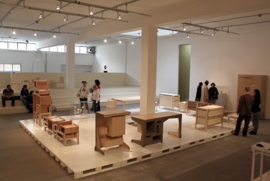
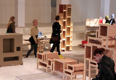
Herman Verkerk: We were working on installations of a cupboard system and we wanted to standardize the design to make it more accessible to people. Digital media came as a good tool for us to communicate the design to the customer, and for the customer, to be able to interfere or interact with it. Ultimately the customer makes the design decisions. We wanted to make a framework and not to define the final design. We made building blocks and the interface so that people can add or transform the design. That gives a lot of freedom.
Tell us more about the kinds of design decisions that the customer can make. What’s the line between you and the customers?
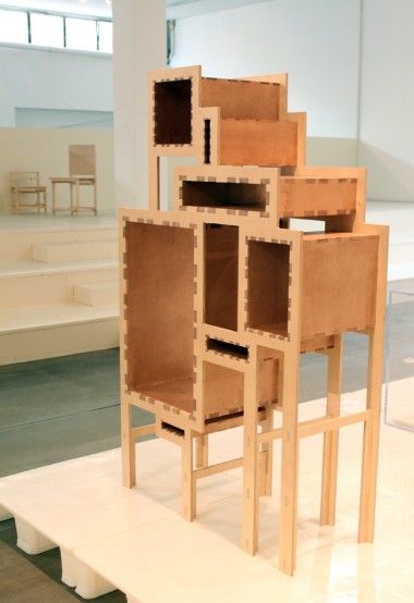
Tal Erez: The process was about simplifying the design and giving options that are very clear. Our designs offer endless possibilities within very simple boundaries. Take for example, Box-o-rama. Dragging and dropping boxes gives an endless range of options. It is a fun process that normal computer users can understand. And this process gives people programmatic choices; functional choices which will eventually determine the design, rather than just decorative options.
Did working with digital media influence the designs?
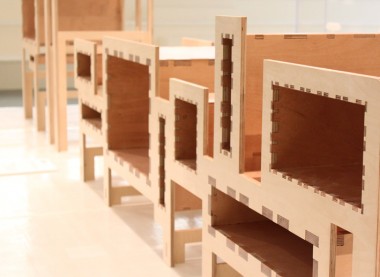
TE: It certainly does by considering the interface from the very beginning. We have to think of an interface that is digestible. And, since a 3D representation on a 2D screen can be confusing, it means the core of the interface should be in 2D. This affects the design, which also starts with a 2D existence. We played with a dotted line, which is a very common 2D representation. Using Illustrator, we applied the same thickness, but modifying the gaps to achieve a specific tone or a unique rhythm in a dotted line. This was then transformed into press fit connections in 3D. The process went back and forth, like a ping-pong game between 2D and 3D in the design, interface, detailing, decoration, manufacturing and assembly. The ping-ponging gave it a specific character. It created a certain visual language that is recognizable. Whatever you do with Box-o-rama it will always be Box-o-rama.
HV: The interesting part of dealing with digital media is that they have their own limits. They give input into how they would structure the design, which is interesting for developing new products. The biggest and most difficult aspect is that there’s no sense of touch involved. You get into this virtual world and there are only fragments of the real thing. We love the gravity tool, which comes into play in Box-o-rama when customers put boxes on top of each other. Gravity is introduced in a digital sense and it’s one of the first steps for getting a feeling for the object. The other interesting thing is that the tool makes decisions of its own, making some options impossible. It ensures that one cannot order something that cannot exist.
How do you feel about opening up design to customers?
HV: We treated the assignment as a way to communicate not only the possibility for a consumer to be able to transform the design and to make his own stuff, but also to communicate about our office and our attitude towards open design. This system is not star designer based. Making a framework instead of defined and finished products is where I see the difference between star design and non-star design.
How do you think people will react?
HV: Knowledge is still transported through humans, institutes, or some other kind of “real world” channel. The internet is able to distribute, but I’m not sure it is able to educate or make people change their behaviour. But once they get started, a big universe all of a sudden opens up.
Since you don’t control the design completely, can you imagine some unintended consequences?
HV: It doesn’t matter that there might be unintended design consequences. What matters is that the process gives rise to a community, one that communicates through design. We really would like consumers to upload what they have designed and made. Or maybe even what they have designed, without making it at all. It is more a way of showing and communicating diversity. We are looking forward of a library of examples, which are ugly or beautiful, but certainly interesting.
Are you not afraid that people will copy your blueprints?
TE: With Box-o-rama and Facades & functions we are not selling a design but a tool. Besides the fact that the tool was not easily developed and therefore is not easily copied, the design is only complete when the user is involved. The thought of the user completing the design actually takes quite a bit of the edge of copying it, because what exactly is it that you copy?


