tool designers: interview with Studio Ludens
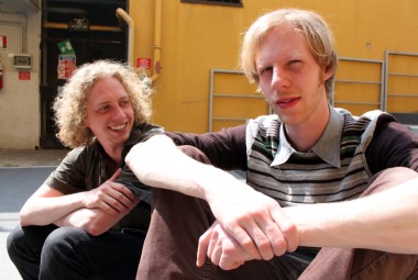
We asked Eindhoven-based design company “whose mission it is to give people the creative freedom to design their own products,” Studio Ludens to develop design tools for the project, design for download. At our presentation in Milan, we spoke with Alexander Rulkens and Wouter Walmink about the tools they created for Box-o-rama and Facades and functions by EventArchitectuur and Wanna-be wardrobe by Minale-Maeda.
Tell us about user involvement in the design of the products. What can they customize?
Each of the designs in their own way offered meaningful customization for the user. Customization is not a value in itself. It is only a means to something. Customization might offer functional or aesthetic choices, and on a meta level it gives users the possibility to be creative, which can be a very pleasant experience.
Wanna-be wardrobe offers a way for the user to determine the functionality of the product. The user knows what he wants and can make that. What’s strong about the digital tool is that it has a very low threshold; everyone can use it to make functional design decisions.
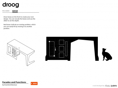
The tools we developed for EventArchitectuur ask for more creativity from the user. The user can make something that feels like it is his own design because the product is ultimately a composition. In Box-o-rama, the user can arrange boxes and this changes the whole shape. It’s not about adding things but about deciding on the whole design.
What was your role in relation to the designers in developing these tools?
The designer was the guardian of the concept, the product and had his own idea of what the changeable options could be. Our role was to be a guardian of the user. We always asked whether the tool was accessible enough and how the options were presented.
What are some of the things you have learned from the process?
Over time we’ve learned that it’s best when the interface is simple, playful and when there is an element of surprise. It’s important not to have too many features or options. That’s one of the biggest pitfalls of all website and interface designs. Sometimes two options are better than a whole range. It’s the paradox of choice; too much is overwhelming.
Do you think that the platform will be successful?
There are many open design initiatives out there. What is quite unique about this project is that we are working with products that have been designed well and that are actually producible. The production and the interface has been integrated into the design of the product. A good designer and a good platform are essential for the success of our tools. If the platform won’t work as it should then our tools won’t have a chance. All the components must come together, and here, we feel it might happen.
Try out the tools for yourself at design for download, via Alserio 22.


